
Reports: PowerCaptain
Speed Monitoring Dashboard
Tugboat mob and demob speeds often exceed eco-efficient speed limits, leading to unnecessary fuel use and emissions. The Speed Monitoring Dashboard provides fleet-wide as well as tug and/or captain-level insights into these patterns. It visualizes compliance trends, ranks captains and vessels by performance, and quantifies weekly and cumulative savings in both fuel costs and CO₂ reductions. With color-coded comparisons and transparent baseline metrics, the dashboard helps managers target improvements, reduce excessive speeds, and drive both environmental and financial benefits across port operations.

Tugs in Monitoring

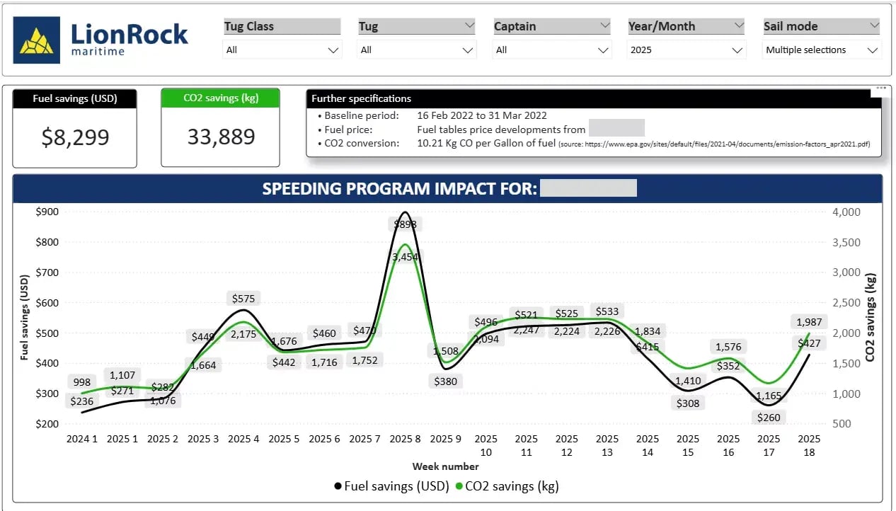
Worldwide Annual Cost Savings

KGs of CO2 saved
Report overview
How the Speed Monitoring Dashboard can help your business
This report presents an example analysis using PowerCaptain’s Speed Monitoring Dashboard, powered by LionRock Maritime, to demonstrate how tugboat speed compliance can be monitored and optimized. The dashboard tracks light sailing behavior across fleet, vessel, and captain levels, highlighting patterns of excessive speed and their operational impact. In this illustrative case, speeding was reduced from a baseline average of 39% to 22%, resulting in estimated savings of €10,000 in fuel costs and nearly 30,000 kg of CO₂ emissions per tug p.a. avoided. These figures showcase the potential benefits of data-driven speed management in improving efficiency, accountability, and sustainability in port operations.

Insight 1
Lightsailing speed development over time
The plot illustrates the percentage of light sailing time during which your fleet tugboats exceeded an eco-efficient speed threshold, offering insight into sailing behavior. It measures the proportion of time that tugs, while not engaged in towing or assisting, operated above the recommended speed—typically 8 knots. Such graphs are valuable for tracking changes in operational practices over time, using a baseline as a reference. In this case, the data shows a clear reduction in excessive speed occurrences, indicating improved compliance driven by the PowerCaptain performance feedback tool.

Insight 2
Lightsailing speeds by captain
This chart compares individual captains’ performance by showing the percentage of light sailing time spent above the eco-efficient speed threshold of 8 knots. Each bar represents a captain, with color-coding—green for low, yellow to red for high—highlighting compliance levels. The visualization reveals behavioral differences across the fleet, identifying both high performers and those needing improvement. It serves as a practical tool for promoting accountability, guiding targeted training, and improving overall operational efficiency.

Insight 3
Lightsailing speeds by tug
This chart compares tugboat performance by showing the percentage of light sailing time each vessel spent above the 8-knot eco-efficient speed threshold. It highlights variability across the fleet, with some tugs maintaining low speeding rates while others show higher non-compliance. This allows fleet managers to identify specific vessels for targeted monitoring or operational improvements, supporting more efficient, eco-friendly, and cost-effective operations.

Insight 4
Detailed speed tracks
This overview gives you detailed speed tracks segmented by lightsailing vs operational sailing by captain. It is a great indication whether speeding was necessary because of a back-to-back job or that it could have been avoided by leaving on time and/or better planning.

Insight 5
Savings calculation
This graph shows the financial and environmental benefits of reducing excessive tugboat speeds in the port. Weekly data highlights how eco-efficient speed management leads to both cost savings and lower emissions. Peaks and trends offer insight into the effectiveness of operational strategies, while accompanying data—such as baseline periods and CO2 conversion rates—ensures transparency. Overall, the chart demonstrates how consistent speed compliance can deliver significant economic and environmental gains.
Included Reports
Insights we provide:
- Lightsailing speed development over time
- Lightsailing speeds by captain
- Lightsailing speeds by tug
- Detailed speed tracks
- Savings calculation
We Have Answers
Frequently Asked Questions
How does the Speed Monitoring Dashboard identify excessive speed patterns?
The Speed Monitoring Dashboard analyzes historical and real-time light sailing data, comparing vessel speeds to pre-set eco-efficient thresholds. It uses color-coded and data-driven visualizations to pinpoint where excessive speeds occur—at fleet, vessel, or captain levels—enabling port operators to quickly identify and address areas for improvement.
Can the dashboard help reduce fuel costs and emissions?
Yes, absolutely. By highlighting excessive speed behavior and quantifying fuel waste, the dashboard helps operators adjust sailing practices and improve compliance. This leads to measurable reductions in fuel consumption and associated CO₂ emissions, supporting both cost-saving goals and environmental initiatives.
How is the data segmented in the Speed Monitoring Dashboard?
The dashboard segments data by fleet, vessel, and captain, giving users multiple layers of analysis. You can view overall fleet trends or drill down to individual tugs or captains, depending on your operational goals. This ensures that insights are actionable, whether you're focusing on company-wide policies or targeted training for specific crews.
What kind of insights can we expect from the included reports?
The included reports provide insights on topics like lightsailing speed development over time, detailed speed breakdowns by captain or vessel, and comprehensive savings calculations. These insights not only highlight current operational practices but also quantify the financial and environmental benefits of improved speed compliance, supporting data-driven decisions for port management.